Friday 13 April 2012

The Blog Rubric


The Marking of The Blog Online
by Nicole Wilk

As the third assignment to our year three Animations class we were charged with creating a rubric that would detail our learning outline for the semester. The goal was for students to choose their own skill sets that they wished to expand upon and set their own goals and projects to develop those skills, whilst also posting educational blog posts selected from the professor. I chose to create a library bank of referance and inspirational material while simultaneously performing practical experimentation in the process.

I wished to make my blog as user friendly as possible and chose to talk in a casual explanatory manner. My blog plan shifted during the process and I found myself leaving detailed records of my projects online for any who wished to know more about my work. I've found that not only are my projects praised by classmates, but the question of how often comes up when one of the projects is experienced/viewed. I believe that leaving footprints behind is an important part of project work that is often ignored after the fact, but would be helpful when people inevitably ask "how". Not only that, but I'm often cast in the role of leader so most creative decisions are made by me, and I play a large role in the other members work.   


ASSIGNMENT OUTLINE

Communication Studies and Multimedia – MMEDIA 3H03—Advanced Digital Animation— Winter 2012

Process Journals/Blogs Revised Specs


Deliverables: A minimum of 15 (8 personal research, 4 required readings, 1 event, 1 work screened, 1 practicioner) posts in addition to the required posts I assign are due throughout term. Required posts include assignment related posts.
Grade breakdown: 30% of final grade.
Other: Self- and instructor evaluation

Overview
As part of your ongoing development as producers of animated work, you will keep and regularly contribute to a journal to document your individual process. This journal will be hosted online in a blog format that affords the opportunity for you to track your learning and to share with others your on-going multimedia sources, inspirations and resources.

This idea of updating and processing your ideas is a way of tracking your own activity while expanding your exposure to animation and it’s many permutations. As multimedia practicioners, it is critical to learn how to situate your own work and acknowledge your influences within the traditions in which you practice.

In addition, this will be a forum for hosting your course work with updates of project development and your own professional development throughout the term. Photos, sketches, storyboards, colour and lighting studies, diagrams, audio, video are some of the material that can be readily formatted and uploaded and linked to your blog. I encourage you also, to use this forum for creative and technical information sharing.

Project Procedure and Guidelines
In addition to your regular project work, you should post regular updates to explore your own interests in
animation. Ideally, each post should be a thoughtful and a well-articulated exploration or analysis of an idea, article or animated or time-based work that adds to your own understanding of this medium. The posts should be approximately one–three paragraphs long and where appropriate include links, visuals and other media to add value.

16 posts in addition to the required posts related to Project 1 and 2 deliverables is the minimum goal and these posts should be spread out and should be representative of your research interests and progress throughout the semester. The posts should reflect a healthy mix of your technical, practical, visual, primary and secondary academic research interests as related to animation.

The following items are mandatory:
•Eight posts related to/delineating your personal learning plan;
•One written reflection of any film/video/sequence you have seen in class;
•Four reading responses or reflections (revised specs on page 2);
•Research and overview of one animator, practicioner or studio whose work relates to your research interests;
•Attending and writing a reflection about one animated and art-based (new media, film, video, installation etc…) on-or-off campus screening. This screening CANNOT a commercial screening at a movie theatre.

Deliverables
Personal Learning Plan (hardcopy)
This is a descriptive and itemized list outlining your individual learning objectives. This list must include examples of technical, practical, visual and primary and secondary academic research objectives with timelines associated with each step. You must also create an assessment rubric (detailed outline of how you would like to be assessed for this section) and describe your objectives or what a successful outcome looks like to you.
Examples of rubrics can be found at:
http://course1.winona.edu/shatfield/air/rubrics.htm
Personal Learning Plan, Timeline, Assessment Rubric  (hardcopy)
See description above, and suggestions/criteria on page two. You must design a usable evaluation system, with objective targets so that you (and I) are able to offer a fair evaluation.
Mid-project Self-evaluation (hardcopy)
Final Journals due (online). Final Self-evaluations due (hardcopy)


Evaluation Rubric
/10—Number of posts:
1-10=F; 11-14=D; 15=C; 16-19=B; 20-23=A; more than 24=A+
This is a mandatory rubric section.

/10—Meeting Blog Requirements and Deadlines:
Jan 17, Feb 7, Feb 28, April 9; meeting assignment criteria.
These deadlines are mandatory.

Regular or systematic distribution throughout term. Using the assignment criteria as a guide, please define a system Ti for evaluating what “regular or systematic distribution” means in terms of your personal learning objectives as you have described them. You must design a usable evaluation system, with objective targets and clear descriptions so that you (and I) are able to offer a fair evaluation.

/20—Quality of posts
Suggested beginning point:
“Each post should be a thoughtful and a well-articulated exploration or analysis of an idea, article or animated or time-based or other art or design work that adds to your own understanding of this medium and to your learning objectives. The posts should be approximately one–three paragraphs long and where appropriate include links, visuals and other media to add value.”

Please define “quality of posts” in terms of your personal learning objectives as you have described them. For example, you could assess “quality of posts” in terms of: written expression, visual expression, functionality, content. You must design a usable evaluation system, with objective targets and clear descriptions so that you (and I) are able to offer a fair evaluation.

/10—Applicability of Journal to Personal Learning Objectives:
The extent to which you achieved your personal learning objectives within the timelines you indicated in your personal learning plan.

Please define/outline a system that will allow you to assess the degree to which you achieved your objectives within the target dates you determined. You must design a usable evaluation system, with objective targets and clear descriptions so that you (and I) are able to offer a fair evaluation.


Reading Responses
One–three paragraphs of informed analysis (not an opinion) vis-à-vis course outcomes, language and your own learning plan objectives. Your response can be written in point form, or composed into paragraphs. One reflection is due per chapter/reading.

For each reflection, please answer the following
1. Three useful, or interesting ideas not previously known, or that have been framed differently for you
2. Three direct applications to the current course project, course content (ie. a screening, guest, workshop), and/or your own technical, practical, visual and primary and secondary academic research interests as related to animation and/or your learning plan objectives.
3. Any questions, clarifications on readings.


PERSONAL LEARNING PLAN

3H03 Animation

I believe art is experimental in and of itself within both the realm of fantasy (abstract) and reality (accurate renditions of life), thus presenting endless possibilities for creation, experimentations, and chances for learning in both the ever expanding and upgrading program software available, such as Adobe After Effects, but also in the materials now more accessible than ever, as well as cheaper equipment. With endless ways to create available I believe the medium being the message is an important concept. The way in which the thought is expressed is important, so my goal for 3H03, and my personal learning plan is to experiment in mediums. 


I wish to consume the creations of others. By that I mean to expand the pool of inspiration I’ve been exposed to and build an effective library of works I find fascinatingly creative. I believe this to be a valuable way to improve my own animation abilities as I benefit from ‘starting points’, that is, by narrowing the endless possibilities of creation to a few I’ve found effective I can adopt others techniques and be more creative than if left staring at a blank page (as exemplified by adopting Caroline Leaf’s sand art during The Lost Kiss 2B03 Final project with beads on a scanner).  A large part of my posts will therefore be evaluating and exploring animation techniques as they have been exposed to and altered by the medium, and After Effects tutorials. 


The other half of my learning plan is to do practical experimentation separate from the inspirational library. Recreating work, though beneficial, is not my goal for the library. It’s intended as a bank I can draw from, apply and adapt to projects through my own renditions; as such I wish my practical experimentations to reflect the ability to perform basic animation in various mediums. As tutorials in 3H03 accomplish basic animation tasks already, the ones I set for myself will be more selfish in nature and will include lip syncing a song verse from existing content in After Effects, making a character do a simple dance gesture from ‘scratch’, weekly photo journals, and the creation of a thaumatrope.


SELF-EVALUATION


Educational Expectations:
I feel that I've gone above and beyond the expected post content. My posts are detailed, they always include visuals (commonly many) with various examples. Links are always relevant, and all sources are accounted for and cited on the page. Explanations are at minimal 2 paragraphs on every post and I've often gone out of my way to make the posts as user-friendly as possible. Some posts include sections and categories.

Personal Expectations:
Although my posts are detailed, with step-to-step explanations on some parts and explanatory paragraphs on others, I did not meet the outlined project quota that I had set out for myself.  When it became apparent that I would not be needing the lip-syncing skill for the Tatterhood project, I cut the exercise from my outline and posted the tutorial as well as inspirational videos to my blog instead. Likewise, I did not do the character dance as I was drawing the Tatterhood animation instead. The Thaumatropes turned out absolutely lovely and have been well received by any who actually get to spin them.

Blog Structure:
As I wanted the blog to be as user-friendly as possible I tried to make the blog clear and casual. Posts are colour coded depending on the category, and the post categories are the first thing you see on the bar to the right of the page. I followed my own type of formatting which included text type, size, colour and position and tried to keep the format as uniform and universal as possible. 

Blog Content:
It's hard for me to judge my own spelling and grammar but I have read and re-read my posts, and any obvious failures should have been dealt with - though I am not perfect. Content-wise I believe I have exceeded, on the most part, above the expectation on post length as well as visual content. All content is properly cited, and not in ridiculous ways. Wherever possible I have linked my posts to other posts, as well as direct users to other sites. Many images had been saved first and then uploaded and cited to their source in case the source-site fails. 

Tatterhood Final Version


There were many obstacles to creating this video, including working out the camera shooting schedule (not from fri-sun), and the animation file glitching shortly before it was due. With my help, and only 2 hours sleep in 2 days, we managed to complete the video in time for the viewing downtown. 


Tatterhood Book Trailer


Sorry. The link took 5 hours to post but it did so without sound. Please click HERE to be sent to a working copy of the video.


Thursday 12 April 2012

The Process of Tatterhood


Rational
Tatterhood Book Trailer

The story of Tatterhood is folklore that has been interpreted and altered through storytelling ostensibly since the 1600’s; in the 1800’s George Dasent translated a version by Peter Asbjørnsen and Jørgen Moe. This is the version that our team chose to animate as it is the closest to the roots of the story and the only visuals it incorporated for us to mimic was in the imagination, as such we desired to reflect the origin of the Tatterhood tale with the visuals of this trailer. 


Noteworthy is our decision to incorporate a dark feeling in the trailer when this mood isn’t reflected in the storytelling: in the scene we selected to depict Tatterhood – although determined – is rather nonchalant about retrieving her sisters’ decapitated head, and embarks on the journey with her sister, prepared to fight a hoard of trolls by herself to get the head back. The way that we represented the story was to incorporate a time and place where disturbing things, like fetching your sisters’ head, could be conceived as the norm.  We wanted to put the words, intended for an audience 200-400 years past, into the realm of its era and entice the viewer to not just want to read more of what events happen in a newly aged-story, but also to incorporate the past and culture buried in the words.


One convention that we used to age the piece was scrolls to animate the opening and ending credits; the same paper was used unfailingly throughout the piece and animated with charcoal. The animation centered on the paper figures, as we used the cut-out 2-D characters throughout the animation and made no attempts to mask the use of paper; instead shadows were utilized to highlight the animation medium as a reminder to the viewer that the story (and everything imagined) is experienced through the page.  


Light was another big animation decision. By using a large tinted glass table, natural morning light was streamed into the room, bouncing off the floor and hitting the glass in an uneven gradient that is aptly apparent through the transparent nature of the thin paper. To have more control on the light a lamp was set up under the table and warm-hued candles were placed to flicker over the art during the photo-capture process.  In order to pull the subtleties of hue from the pages the tone, contrast and colour were adjusted in Photoshop. All colour in the animation came directly from paper.


How it was created:


This section will be updated shortly. Images have to be compiled and made into low res.


The scrolls curled up and formed the image of the goat scene

the size of the art


Paper printed stop-motion silhouette CG animation

Bad Apple!
Paper printed stop-motion silhouette CG animation


Beautiful use of stop-frame animation. When the video starts a hand places a small paper square on a small stand on a greed grid. This cements that the viewer understands that the video is created using small pieces of paper. What I particularly enjoyed was the frame rate printed just below the image (most likely to keep track of the paper, but also to show the viewer the process of time).  The creators soon remove the paper (which is animating quickly) into the air on string with the gesture of a character throwing an apple. The camera becomes a key player in the animation as it, as well as the animated scenes, zoom in, changes angles, and sets the frame of the video. Other techniques were to hold the camera still and have the paper move, and rotate. When a shadow is incorporated the creators created a physical shadow over the paper, and when the work inducated darkness would cover the scene in a shadow, then used fire the character had created to burst concentrated light unto the paper.  At another point there are three pieces of animated paper at once, and when zoomed in to one shapes burst out of the page and rotate away.

It quickly becomes apparent that the square of animation in the paper is properly aligned, always, which means a lot of work was done in editing to ensure that each frame of 6565 was perfectly connected. 

This work is a beautiful display of art and it incorporated so many aspects of animation including stop-motion by mizing computer art printed on paper and assembled with a camera. The animation itself is absolutely amazing, but it pales in comparison to the techniques used to highlight that work as described in the first paragraph.


Bad Apple!! - Stop Motion PV 

  Video posted comment:

sm9519847 - コマ撮り実験アニメ「6566/6566」【Bad Apple!! PV【影絵】アレンジ】.mp4
http://www.nicovideo.jp/watch/sm9519847

**EDIT2: Ten months later and this video reached 1 million views. Thanks a lot everyone who spent time watching "Bad Apple!!" Extra special shoutout to those who felt inspired after watching this video. I can't take any credit for its creation but if it help bring a smile to y'all then I'm pleased.

*EDIT: Less than a week, the video has nearly 200k views and featured on Cirno ⑨ News Network. To show my thanks, I added annotations translating the song with a few comments during the interlude and ending. I prefer to watch it w/o annotations first to appreciate the video first. Then watch it the second time reading the subs if you are interested in the song.

It's been a while since I last uploaded something from Nico Douga and this one caught my eye. Followers of the Touhou game franchise would recognize the source song and video "Bad Apple!!" by nomico as it maintained 7 solid weeks on top of the Nico Nico Douga weekly rankings.

For the record, I don't own the video. It was uploaded by Shige-ruuu on Nicovideo.jp. If you have a Nico account, check out his other videos at - mylist/767941


  Want to know more:

Used an adjustable lamp, green-grid matte, rotating circle table, a clicker button... what appears to be a web cam on a positioning device.  Sheets and sheets of printed out, and then cut frames, that were stored - in order- in a box.

Bad apple stop motion - making of 


  Video posted comment:


http://www.nicovideo.jp/watch/sm9560637

The music starting at 01:58 is IDOLM@STER「てってってー」(miku)


Rotoscoping Fan-Based Transition Video


  Character Dance Hit!


Without knowing the context of the video I found this, and many other animated videos on the web. These videos are all fan-based and include characters from anime participating in certain movements to transform into other characters.


【手書き】 何系でもないメガテン 

This video is from a video game, turned anime, Persona 3. And at the time when these videos were a hit on youtube this was the best one that I could find. At the time I did not know of rotoscoping and thought one artist had done the work, and others had copied. In my search for information about this blog I discovered the source of the clip which was an ad (I think for jackets) with a popular asian boy band.  I believe there are as many as 400 drawings to get the animation smooth, and drawers had to incorporate characters different outfits, and facial expressions.  

Once I found the boy band video, which was the source, I found an assembled compilation of some of the videos that were created by fans. Though it's not shown here I believe some fans mimicked other fan-drawn videos which caused some of the rotoscoping art to degrade over tracings.

Nanidemonai Collection


 I believe this clip to be a brilliant display of artistic ingenuity. The drawers have taken a live clip and rotoscoped it in various ways. At about 0:52 of the video above the artist added in a hair swipe, where the character incorporated a movement to restyle his hair.  The second dance shown at 1:07 uses only 2 characters who experience distinct wardrobe changes without incorporating the jacket aspect of the original video. At 1:26 you can see that the artist played with the original intent of the jacket motion. At 1:38 the artist incorporated colour, but didn't finish the video. At 3:27 the artist incorporated the jackets, but saw fit to change them to styles the characters would wear. 


I think rotoscoping has found a fan-based niche in the world of anime and video games, where popular dance video's or commercials can be interpreted by fans who wish to see their favorite characters do something amazing.   


Written by Nicole Wilk


A look at Music Art


A look at modern & abstract art with music

This video was found by a friend who fell in love with the illustrations and song, and then shared it. The video takes a modern take on the abstract form of art.
The opening scene starts with shifting cardboard cutouts of an audience, and a collage-assembled stage. Creatures and limbs hop unto stage with signs for heads to introduce the video.  

When the main character appears she instigates animation, by opening her mouth (wide) rain starts to fall on stage, and she abruptly closes her mouth the stage shifts to a new dark location where weird eyes on poles mimic stop lights, with bushes that are made up of hands. My favorite scene is a simple one: at 0:37 the girl is singing in colour on a plate, everything is cast orange and scales boarder the top and bottom of the frame. Carp swim around her and as she sings bubbles come out of her mouth. The scales on the boarder move at odd intervals, this is very simple but effective.


夜な夜な夜な 

This video incorporated computer-based collages to create a simple yet effective piece of commercialization art and was an unofficial PV for Yoeko Kurahashi. I enjoy this video and wanted to share it because of the effective use of creative imagery, the adaptation of media, and the conventions of art used.  

Written by Nicole Wilk 


From the source

歌:倉橋ヨエコ / アルバム「婦人用」収録曲「夜な夜な夜な」ショートver
映像:エジエレキ / 映夜祭'07 公開作品 / 非公式PV

Song:Yoeko Kurahashi / "Yona yona yona"(short ver.) from Album "Fujin-yo"
movie:Edielec / Played in Eiyassa'07 / unofficial PV


If you enjoyed the above video, I urge you to check out the one below:

たま~電車かもしれない


This video incorporates shapes using a girl with a shawl to create her environment, incorporate her environment, make copes of herself and use shapes to perform transitions. Simply Beautiful. Check it!


Motion Image

to be added later

Fish Stop-Motion

Self Study
 
by Nicole Wilk

This is a 15 second stop-motion animation clip. I wanted to explore a continuous stop-motion project, which would have succeeded better had it not been a windy day knocking the porcelain fish off stones, this hindered the continuity aspect of the shooting. I do not have a clicker for photo-taking. In the birthday cake stop motion I learned that a clicker would have made things infinitely easier as it would free my hands and maintain even images throughout the shoot. Unfortunately, the wind also blew the tripod and affected accuracy again.

I started the shoot by projecting the locations of the cat and the 3 fish, then altered that perception by changing their locations during the movement of the piece. A part of this project goal was to incorporate the texture of stone and light as a reflection of the underwater ground, but at the same time to separate the cat of this reality with the grass background. I played with the angle of the camera and had my fish move in and out of the frame as well as to hint the location of the other fish by having them enter the frame.   


Colour Animation Study

Self-Study
by Nicole Wilk


Colour is a vast subject to study, so I narrowed down the goal of this project to incorporate the shifting and blending of colours. I wished to create a piece like this since I'd created a similar technique in opening to the video What I See. But more than that I've watched how mesmerized people are in the McMaster Mac Lab when the screen saver, an aurora of colours, come on the screen, and once I witnessed a student snap pictures of the screen saver with their cell. 

Taking this idea of merging colours further I photographed a journey on a bus. These images captured an array of colours over a 20 minute period of new locations. With these, I zoomed into the image to the max (600x) which amplified and isolated most colours from the image. This idea was conceptualized in a previous Vector project where we isolated a square of an image from a magazine and combined 5 of them to create an art piece.   

Once the images were blown out of proportion I added layering effects to merge the colours into themselves and then used photo's from the shoot to give the mind a focus point and maintain interest halfway through the production. This piece has no audio as I did not wish to distract the viewer or have the viewer time the shifting of colours to a beat.

A Study of Colour


Below are the original images. All these images are included in the video above, most 2-3 times from different sections of the photo.


From the view of a bus

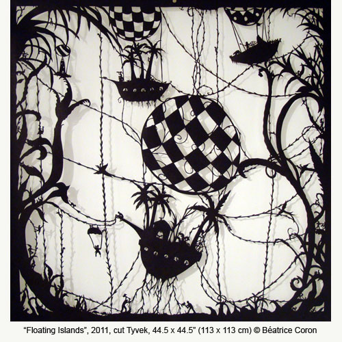
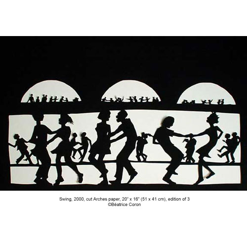
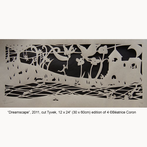
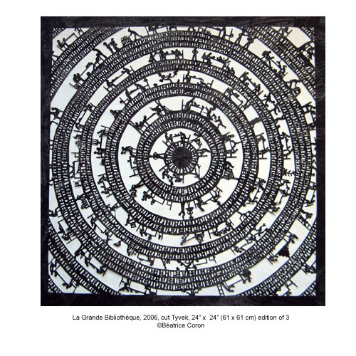
Béatrice Coron: Stories cut from paper


Artist
 Thanks to Professor Franci Duran  who shared this artist with me.


When I first watched this video about Béatrice Coron and her work of converting flat paper into stories with nothing more than the medium (paper) itself I was amazed at what one can accomplish. Paper is a tactile surface that has long been used to draw on, be coloured upon, and have things glued to - but what Coron does is use paper itself to create art. She uses negative and positive space to tell entire stories and create entire worlds with cutouts.  This begs the question, why did Coron decide to use paper as art, she said this:
"So, I chose paper-cutting because paper is cheap, it's light, and you can use it in many different ways."

Corin wasn't an artist, in fact it was only late in her life that she re-invented her identity. Well learned about the world and languages, Corin spent a fair chunk of her life in countries other than France and has taken up various odd jobs in her life. She's resided in China, Egypt, Mexico, and the States. It was in 1985 that she moved to New York and reinvented herself as an artist. 

 "And I chose the language of silhouette, because graphically it's very efficient, and it's also just getting to the essential of things"
 I share an affinity for Corin's love of silhouettes, and find that a great amount of detail can be attained in the outline of a shape. Silhouettes to me are a breakdown of how the mind can interpret design, and offer a more abstracted but often powerful image in its simplicity. I have just begun to work with silhouettes, but Corin has spent her artistic career working and assembking them, she has this to say:

My silhouettes are a language I have developed over the years. I create artist books for viewer to step in, or fine arts with illustration methods. I favor an expression that would involve all my creative instincts. With full and empty shapes, everything must fall in place: one’s place in the world. 

Corin is a  women who creates entire worlds with her silhouettes.


All art was taken from Corin's website which can be visted HERE.


Béatrice Coron's art is not static, nor is is entirely flat. Because her art maintained the same form as she grew as an artist, she expanded her art in the experience of it. Coron's work can be taken off the wall, it is not confined as many conventional art is, after all, a painting can only be experienced by having it angles right and a person standing a certain distance away. This is not the case in Corin's work. She moves her pieces from thhe hall, creates art that is meant to be stood behind, worn, and even experienced with wind. I find Corin to be a truly dynamic artist and one I will look to for inspiration myself.

Written by Nicole Wilk